graeybane
Clan Member  Head Clan Enchanter
Posts: 108
|
Post by graeybane on Apr 25, 2006 0:22:48 GMT -5
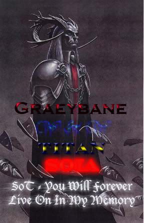
Ok, I fooled around on Photoshop for about 4 hours with this and finally made my first siggy, my own...I know its amateurish but I happen to be pretty proud of my own work  However, I would like to know what ya'll thinketh of it  |
|
|
|
Post by Srfred on Apr 25, 2006 6:37:45 GMT -5
i like it but... it is too hard to read Greaybane and W & W.. it like blends in... lol
|
|
|
|
Post by liglegen on Apr 25, 2006 14:49:43 GMT -5
What Fred said. The name is hard to read. I didnt' even know it was a name, same with the W&W sign and I just noticed that it also says titan. You could be better off with going with something simple stick to one font style. What your doing is like doing this . Which is not cool.
Off topic: Sweet your from SoT. I used to troll that place :-D cause it had an active trading forum.
|
|
|
|
Post by nomonkey on Apr 26, 2006 19:15:29 GMT -5
the white font blurr is TIGHT man, its cool lookin
|
|
|
|
Post by aznkrazypho on Apr 27, 2006 18:29:43 GMT -5
lol i think its kinda clogged in lol text is half of you pic haha but still nice
|
|

 However, I would like to know what ya'll thinketh of it